|
|
|
|
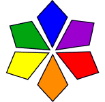
Use of color in creating scrapbook pages can be looked at in much the same way as it is in art, or interior decorating. The use of color schemes can really make the difference between an average page and a work of art. Color can be used to convey a feeling, a season, or an event. Color can also be used to highlight your photography rather than compete with it. When I sit down to work on a page, I first set out all the pictures I may choose to use on that page. After choosing the best photos to represent what I'm trying to capture in my page, I consider how color can be used. I try to pick colors that will enhance my photos, taking my cue from some of the colors that are found in my photos. Below is a very simplistic version of a color wheel, but it helps to explain some very important concepts regarding the use of color.
Primary Colors--Red, blue and yellow are called the primary colors. They are pure colors, which which means that you can't create them from other colors, but all other colors are created from them.
Secondary Colors--Orange, green and violet are secondary hues. They are formed when equal parts of two of the primary colors are combined. Tertiary Colors--By mixing an primary color with a secondary color, a tertiary color is made. Many hues of color can be created in this manner. By looking at the way different colors relate on the color wheel, many different combinations of color can be created. Here are some examples of color schemes that can be used in your pages: This is an example of how you can use a monochromatic color scheme. Each color is shown with three different hues, which when used together in a layout can give you a simplistic, yet classic for your pages.
Complimentary colors are a set of two colors that are directly across from each other on the color wheel. When these colors are combined in a layout, the result is usually a very vibrant and pleasing look.
Here are some other very interesting and beautiful color combinations to try:
There are so many different combinations of colors that it would be impossible to show them all. Do be afraid to experiment with color. Set some different papers out together and see how they make you feel. Then just trying different colors until you come up with the perfect color scheme for your page. |